PACKAGING
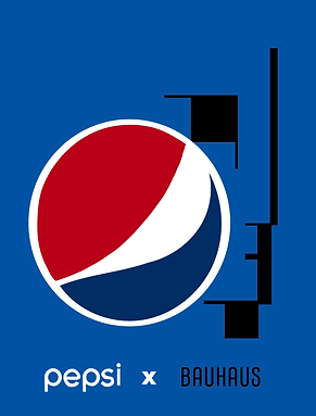
PEPSI X BAUHAUS
LOGO
Timeline: 1-2 months
Upgraded: roughly 3-4 weeks
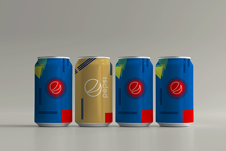
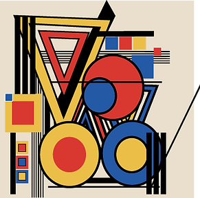
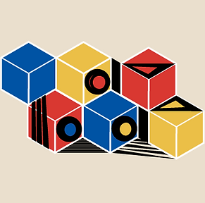
Goal: The challenge was to create a packaging project with a historic graphic design movement/style and well known brand we see today.
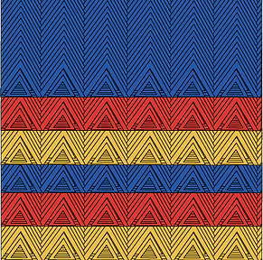
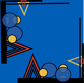
Solution: I chose the Bauhaus Movement and the Pepsi brand. I thought these two would collaborate best because they have a similar color scheme and their simplistic design style would mesh well with each other. I first brainstormed the main visual elements they both had in common and created a 6 can concept that uses simple shapes and primary colors to tie everything together. When it came to designing, it was free for all, using simple shapes like squares, circles, and triangles, different strokes and/or patterns. I wanted to maintain the classic Pepsi look while giving it a modern look and feel. This potentially could be marketed as limited edition summer time cans.
What can I offer to a job
BRANDING
PACKAGING
MARKETING
CONCEPTS


MOCKUPS


WHAT I STARTED WITH